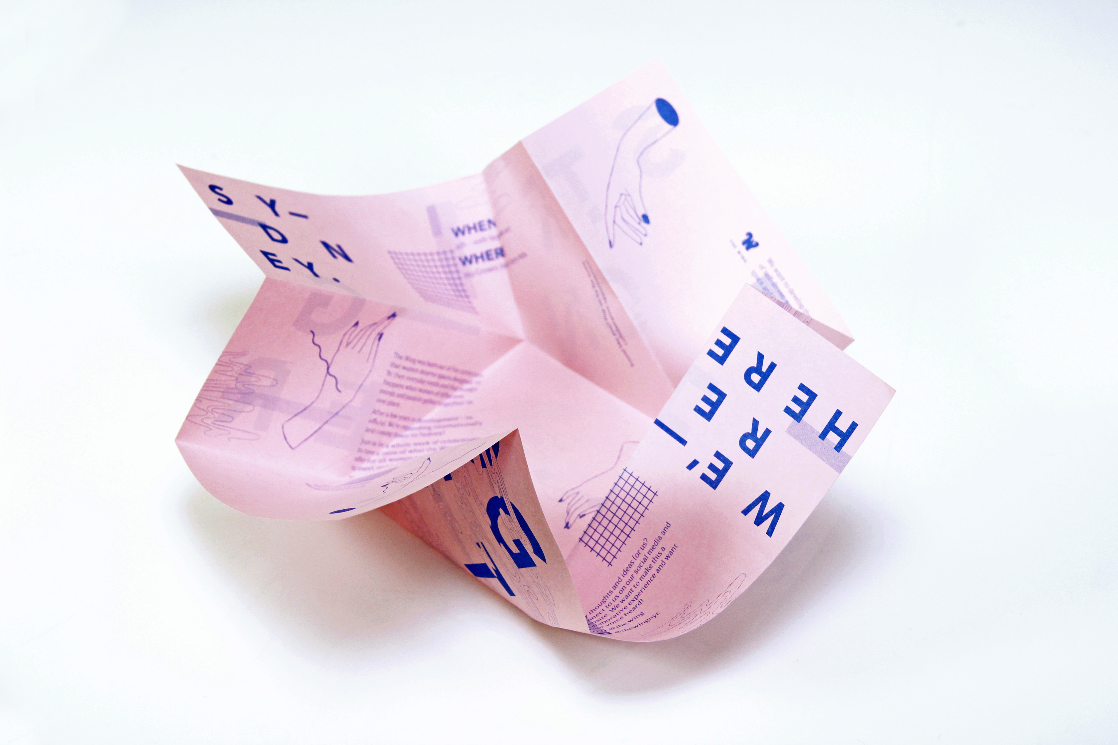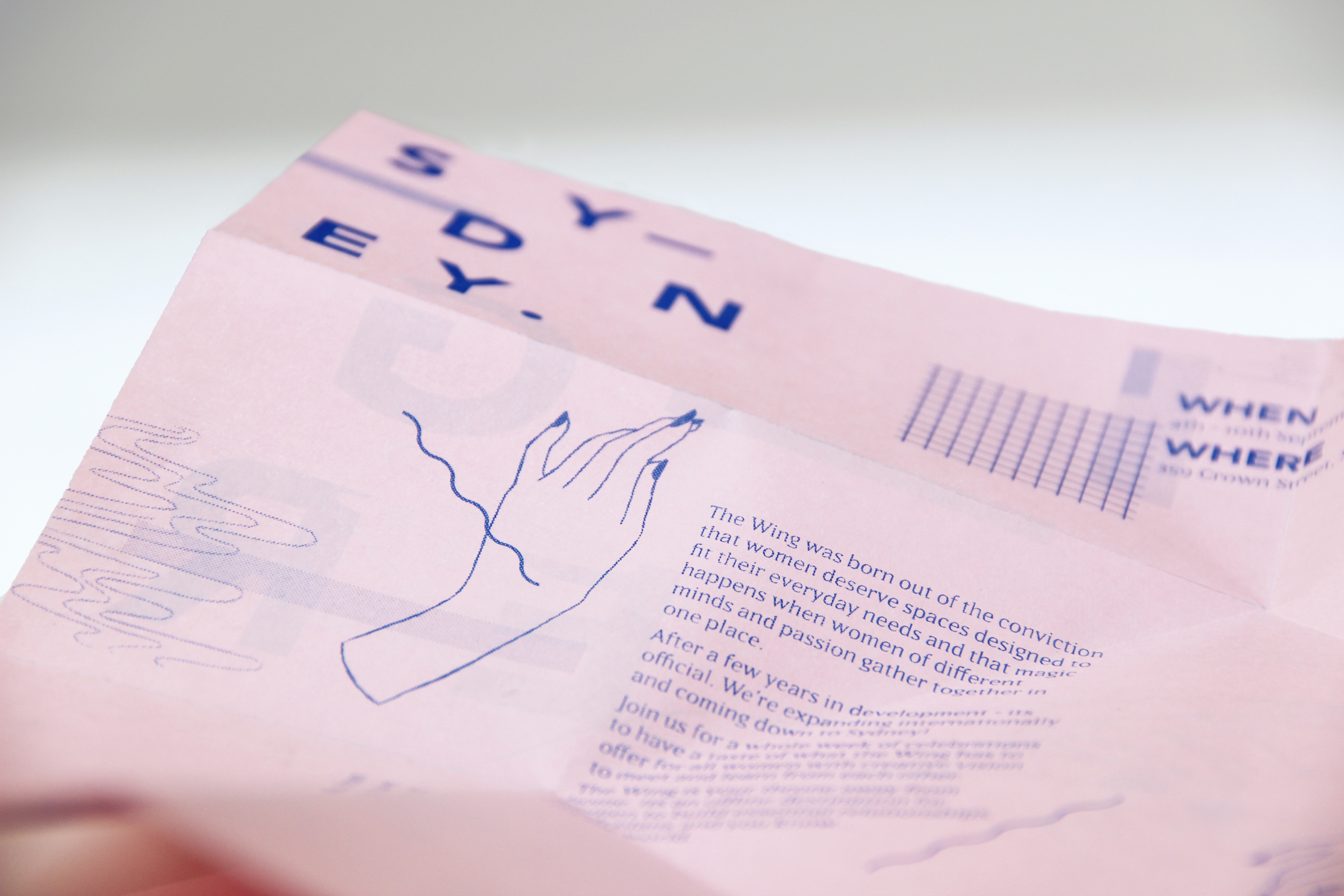
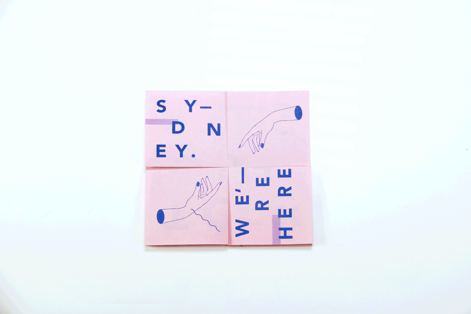
In response to the brief for a promotional flyer-poster for The Wing’s expansion to Sydney, this design sought to emphasise the message of collaboration and strength between creative women and highlight the notion of inclusivity.
As The Wing moves beyond their American roots, the necessity of fostering an inclusive environment for all women throughout the world and particularly in Sydney is reflected in the choice of the twist fold. The twist fold is a physical metaphor depicting The Wing’s growth, and adds visual flair and movement to the design, generating interest to the flyer.
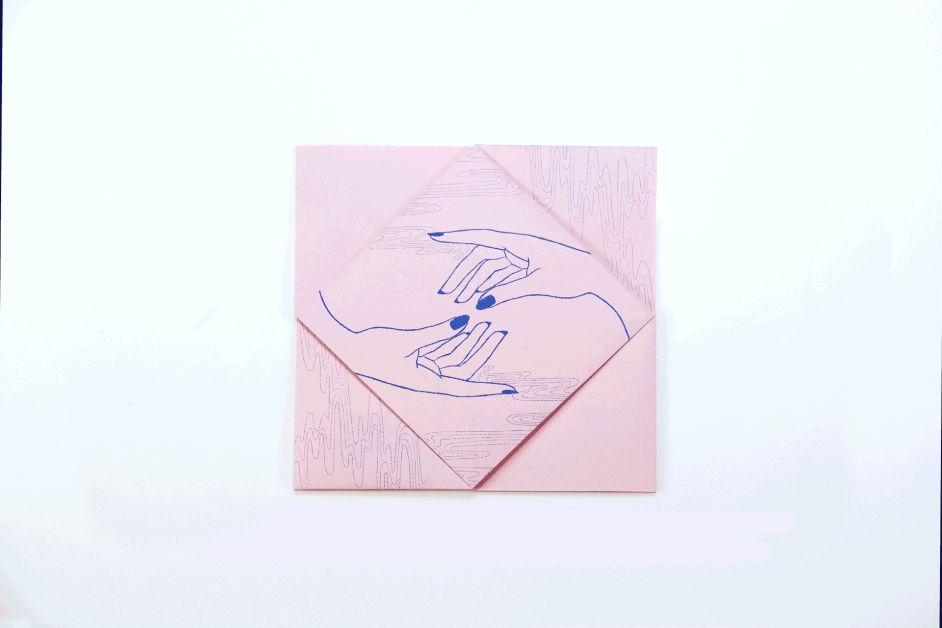


The choice of pink paper in combination with blue ink works closely with The Wing’s own branding whilst providing a contemporary twist. By using strong typographic treatment and delicate, clean line work of the illustrations, this poster depicts the strength and beauty that The Wing embraces throughout their work.
The use of ripples as stylistic embellishments generate a mysterious mood to the event and flyer, captivating audience’s attention to encourage them to seek out the opening event for The Wing Sydney.
Printed with a risograph machine, this flyer is also an experimentation with new forms of printing, and an exploration of the texture created by risograph printing.